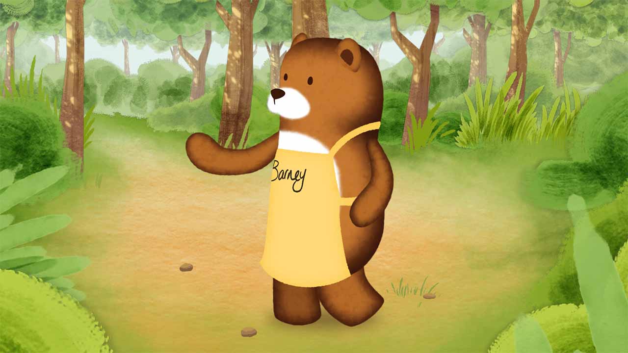
We’ve just finished a TV Commercial for Ponderosa and the food brand Sweet Freedom. The advert sees the characters the brand has on their bottles come to life. With the initial illustrations having a painted/textured look. we had to look into a way to translate this into the animation. Not as easy as we first thought.
Here’s my tips for any After Effects users wanting to do the same.
Top Tips
Initially we intended to use Photoshop to recreate the animals, but at this early stage we weren’t sure exactly what the characters would be required to do once we began animating. With this in mind we looked at a way of achieving a painted look, using basic vector shapes within After Effects.
For the main body sections, we just needed to get a nice soft edge to the characters. To achieve this we used a Gaussian Blur to soften the shape, then a Roughen Edges to add some sketchiness to the outline, and finally a CC Vector Blur to give a nice, soft finish.

The next layer is where the paint-look really takes shape. This was also made a lot simpler half-way through the process of developing this look, by Adobe’s introduction of the new Track Matte system in After Effects. Out went the Set Matte effects and duplicate layers, now it’s simply selecting the layer you want to use as a matte and it all just works!
This stage starts with a couple of simple vector shapes. A large Gaussian Blur to really soften the colour area. A few Turbulent Noises (because you’re worth it) set to the Screen blend mode so they add together nicely. A CC Vector Blur gives a really nice look of paint daubs, which when it’s all coloured as desired using a CC Toner starts to blend in nicely.
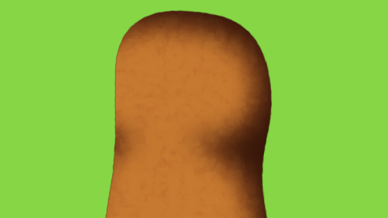
For the limbs this was mostly the finished look, obviously the blurs and effects needed tweaking for each part, but the general idea was the same for every part of the designs. The addition of the CC Vector Blur takes the edge off the edges created by the noises and roughen, which can look a bit too obvious on their own.
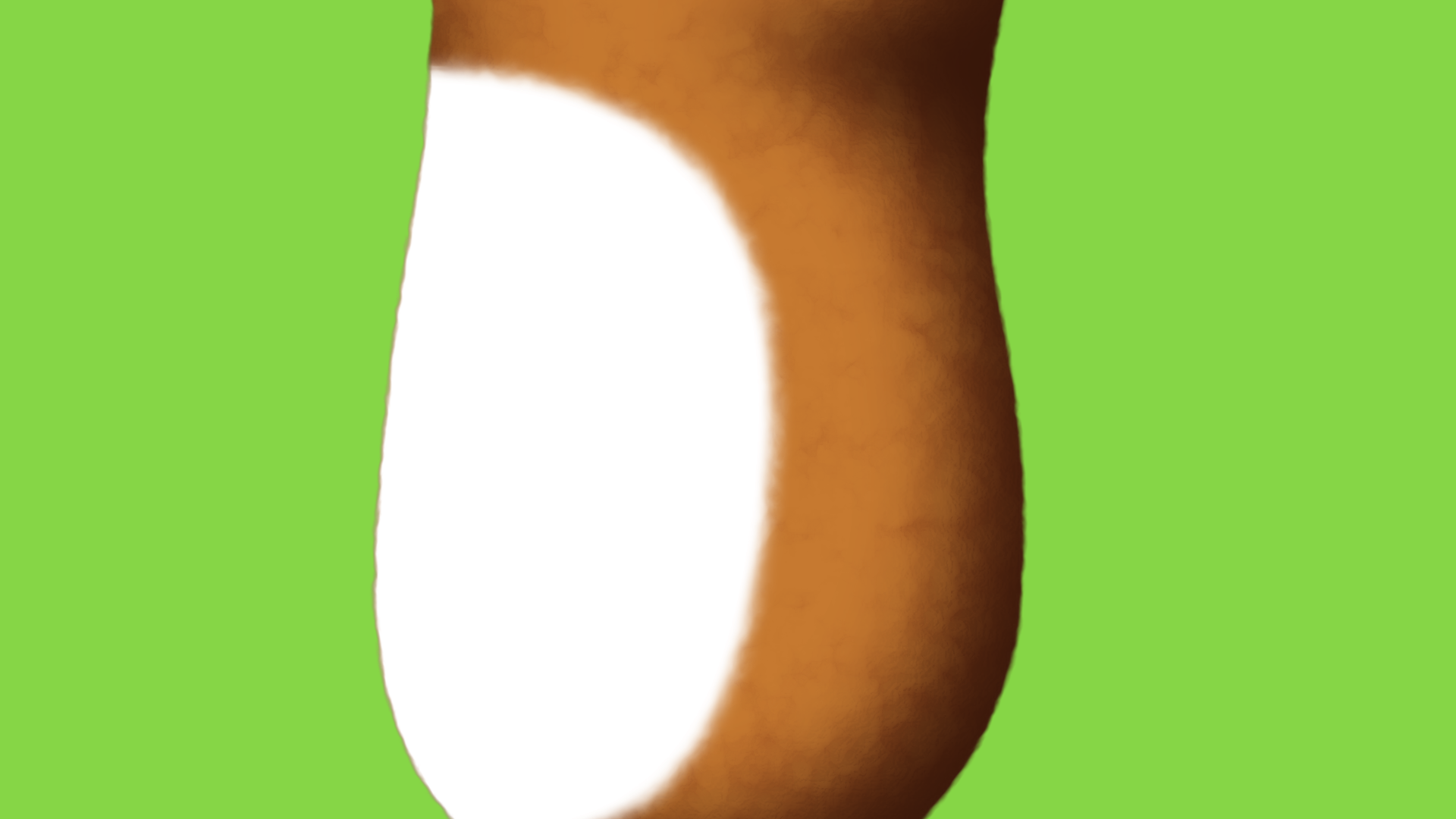
The final stage of this character was their white belly. Again we used Gaussian Blur with a Turbulent Noise. Placed over the coloured torso, it blends in nicely.
The final character in all his “painted” glory.