
Every week in the studio we do the “round table” where we look at projects, ours and others, and critique. It’s a chance to look, around. Sit up and take a breather from the daily work and reflect and gain inspiration. Earlier this year we had a team meeting where our showreel was discussed. The question was rightly raised as to whether we felt it truly reflected who we are NOW. So we decided to do a new reel.
This was where we started to hit a problem. We wanted the reel to say more about who we are, and where we want to be. But something was blocking us. How should we say who we are….and the logo. Well, it just didn’t fit. Our old pink swirly logo, much as we loved it, needed some changes. A rebrand had been born.
2023 was the year when we turned 13. Like all teenagers, it felt it was time to grow up a bit. An opportunity to shake off our younger years. Become bolder, more independent. Maybe try a drastic hair cut.
Over the last couple of years we’ve changed shape, and size. Covid may have been coincidental to this, but we’re definitely a different type of company to the one we were three years ago. And better for it. The type of work we do has changed, as has our processes, and our team.
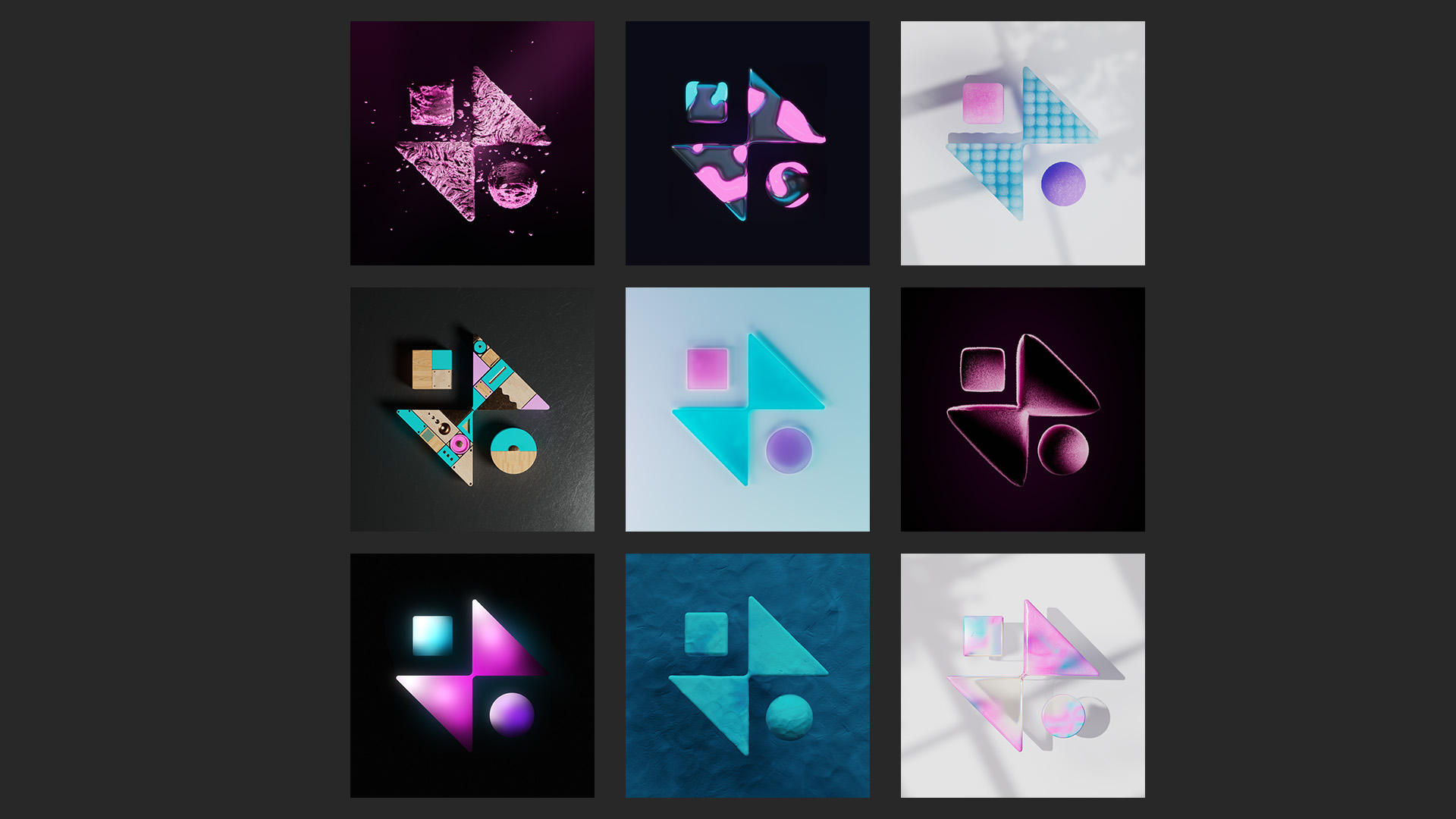
But what we do hasn’t changed, which is a wide variety of animated work. Despite our client base shifting, we still get as much pleasure from animations for CBBC as we do big shiny 3-D projects for a global brand. We are proud of our “No House style” approach. Therefore we needed an identity that could adapt, that could change according to the output. Something that could work in many different styles, and that’s what we got. An identity which can change and move. One that can animate.
One thing we’re not short of in Manchester is amazing design and brand agencies. Some of our team are designers, but we’re not brand designers. We definitely wanted someone with fresh eyes to take a look and help us steer where the brand would take us.
Having chatted to a few agencies, we decided that the team at BGN seemed to best understand our world. It also helped that we’d worked on projects together before, so they understood us as a company. The design process was fascinating, especially being client side for once. As important as the look was the language; they helped us to develop a vocabulary about what we do. A clearer and better way of talking about ourselves.
We always look to find the best tool for the job. The method and style that delivers something your audience want to watch. That’s what being “more giant” is all about; animation that makes the audience sit up and take notice.
The icons in our logo device? Keyframes; the building blocks of all the work we do. If you’re curious about what these are, you’re always welcome to come by the studio and we’d be happy to get nerdy and give you a run down of how they work.