
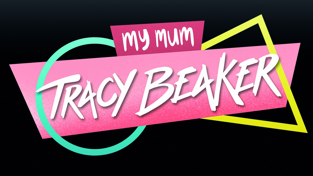
Tracy Beaker has been a staple of children’s television for almost twenty years. For all that time the show has been accompanied (and almost inseparable from) the illustration style of Nick Sharratt. So while we were honoured to be asked to design a logo for the new adaptation of My Mum Tracy Beaker, the fact that we would be breaking away from the Nick Sharratt aesthetic, was slightly daunting. I know what it’s like to be a disgruntled fan – I refuse to admit that The Simpsons is still making episodes – so we knew we had to stay sympathetic to the older style.
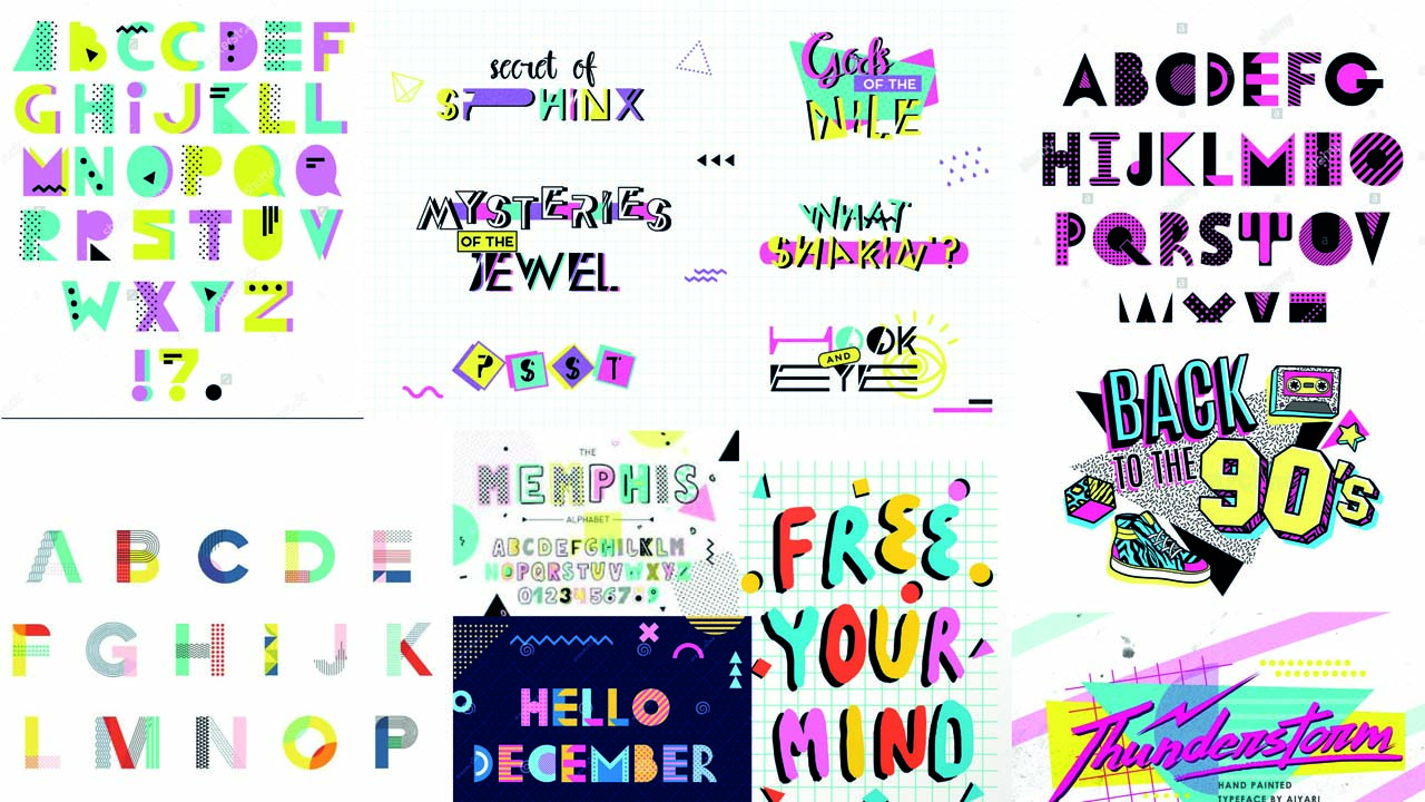
The production design was heavily inspired by a 90s style (to reflect the era when the original books were written), with a big influence from the Memphis design style. The idea was to update the logo to represent the more grown up Tracy Beaker, but without completely abandoning the style that has been so synonymous with the show’s history.
We also needed to reflect the fact that the audience has grown along with the characters, so we’re not targeting an exclusively CBBC age audience.
After spending a few hours reminiscing about Global Hypercolor and Fido Dido, we created a mood board with references and examples of Memphis inspired typography and logo designs.
After a discussion with the client about which direction to aim, we created some handwritten versions of the Tracy Beaker text, and played with mixing these with shapes and patterns inspired by the Miami style. The client was happy with the initial rounds of designs, and after incorporating their feedback we had our design and were ready to move on to the making it move..
The producers were keen to see an emphasis on the “My Mum” aspect of the logo, to reinforce the show is told from the perspective of Tracy’s daughter. The relationship between the text elements in the animation mirrors the characters in the story. The daughter’s text is displayed, but is then overpowered and pushed out the way by the personality of Tracy’s.
Along with the main logo, we were also tasked with creating the opening credits and some extra graphics, which needed to work together as a whole package. This allowed us to incorporate more of the geometric “Memphis-style” elements that were deemed too busy for the main logo.
To see it in action, head to the iPlayer from Friday 12th February 2021