This blog post stemmed from a conversation in the studio, where we were looking at the multitude of ways we could tackle a project. As you’ll see from our site, we rarely have two projects the same. So, here we go with a three part blog, looking at the different styles of work you can find in this magical world of animation and motion.
One of the original forms of animation, frame by frame drawing. Think of early Walt Disney and this is cell animation. The name comes from the original technique of drawing and painting onto transparent cels. As this article in Concept Art Empire explains “animators transfer draft drawings onto transparent sheets of plastic called cels. Each cel features one drawing with an outline on one side of the plastic and the color is filled in on the other.”
The process has developed, but the technique of drawing frame by frame lives on. We worked on some tests for a TV commercial earlier this year in such a manner, every frame a different drawing. Other forms of animation struggle to have this flexibility which is why it’s such a great form of animation. The downside, there’s no cheating, and very few shortcuts.

Stop frame animation, or stop motion. Again, one of the original styles of animation, but definitely one that is seeing a huge renaissance. Wallace and Gromit ensured this style never went away and it’s definitely seem growth in the food video market. There’s something to the aesthetic that ensures it’s appeal endures.
I love animation director Chris Hopewell’s theory that it’s the creepy insect feel that keeps us coming back to it. “I’ve had this theory for years that people find stop motion a bit eerie because it has that insect-y movement. We’re pre-programmed to pay attention if you see something moving or clicking like a spider or scorpion. Stop motion has that same real-but-not-real look to it, and it can be quite entrancing.”
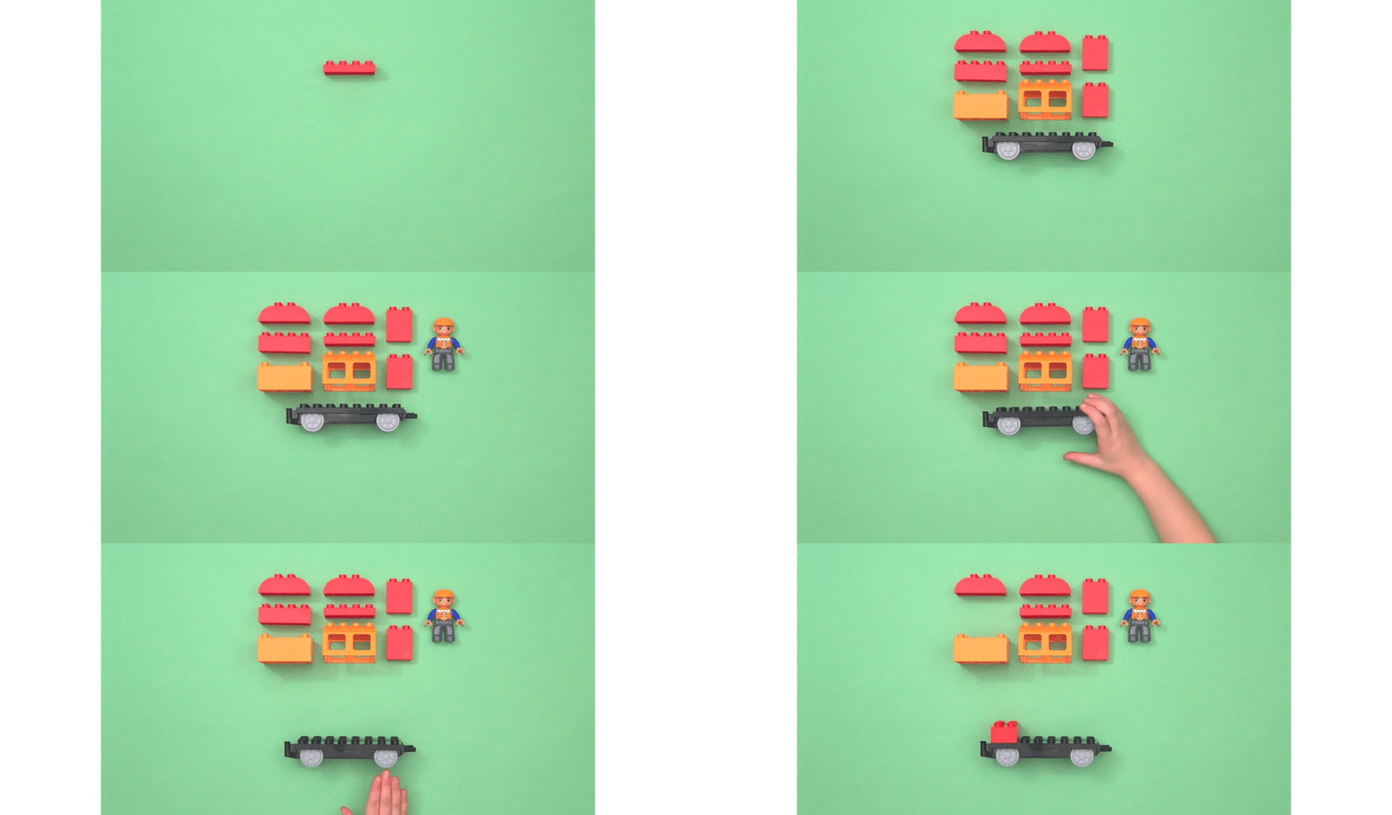
We’ve worked on a few stop frame pieces over the years. Our first, and the one where we learnt an awful lot, was this piece for True North’s LEGO Education campaign. It’s a slow process, literally taking a photo frame by frame. Frame. Stop. Frame.

You could possibly say this is too broad a category, but it had to come up on our list. It’s also such a crucial part of how we work at Mighty Giant.
3D Animation is essentially the technique of using 3D software to produce your animated project. At Mighty Giant we use Cinema 4D, other studios use Maya, 3DS Max, Blender, or a combination of any of these.
Using 3D gives you the flexibility you’re not afforded with Cel and Animation aren’t. Once you’ve built your models, or your scenes, whatever it is you need in your story, you’re then free to move the camera around within the scene and direct the action.
It’s also rapidly taking over. Studios that specialised in 2D are now seeing the benefit and flexibility of a 3D pipeline. There’s an awful lot of 2D looking animation out there that has been created in 3D software.
An interesting example of this is the animator James Curran, who came to fame with his Gifathons; a new animated GIF produced every day. His latest project has seen him take these 2D animations and turn them into 3D, in other words, changing the software he uses. It’s an interesting case study of an artist changing discipline. Likewise the amazing animation studio Cub have taken this leap, seeing the flexibility this method afforded them.
What’s a vector? There’s a science behind how they’re made, that I think we’re best letting Adobe explain that. The main benefit is the quality of line that they use, which is great when you’re scaling up and down, which animation will often involve. That’s the science, however the word has taken on its own meaning and has become a style of its own, and there’s a LOT of it about.
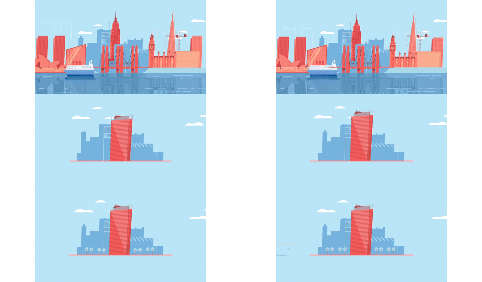
We’ve worked on a couple of pieces you’d class in this style, the job we did for Social a couple of years ago being a good example. Animation projects work best when you are doing it properly. This means you’re joining storyboard frames together to aid the story; filling the gaps between. The vector style works well because you are essentially animating from an illustrators work. Rather than the storyboard be a bunch of rough sketches, they develop into full pieces of artwork, then the animators job is to bring life to this.

Mighty Giant are half animation, half motion design. Or both combined, blended. We’ve blogged before about the difference and the fine line that separates them, but we’re calling Motion Design as a form of animation right here!
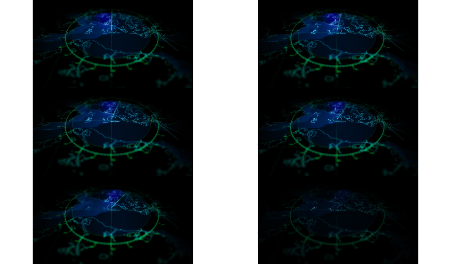
Motion design is based in graphic design. But whereas traditionally graphic design would end up in print. the end product with motion design (or motion graphics) is a moving piece, that by its nature is animating. Also you’re not limited by the medium used. Quite often a Motion Design piece will combine footage with animation, or with text, or a bit of everything. A couple of years ago we built a few of these types of piece for ABP, blending footage with graphics.
