

Right from the start let me make clear, we are not UX, or UI designers, we handle the motion graphics bit. What I’m writing about here is how crucial it is that the movement on an app or site is done well.
When we use an app, or a website, it is the way the site moves that attracts our eye. We’re massive fans of the easy ease here at Mighty Giant. Until you’ve seen bad easing you won’t realise how much it can jar.
Before we go too much further it probably makes sense to explain a bit about what easing is. It comes from the very first principals of animation, Walt Disney days. Essentially it boils down to something coming to a sudden halt, vs something slowly easing into position.
How quickly, that happens, how smoothly, and whether it wobbles or just docks into position is where the art and craft comes in.
So that’s the nerdy motion bit, how does that relate to the User Experience? Well, nearly all of the below has this considered in it’s design. It’s almost always when you see it done badly that you notice it!
We expect icons to respond when we interact with them. “Animation can become the key functional elements that enhance an app’s usability and desirability” as this article from Imaginovation explains.
When you click or push in an app you expect it to tell you it has received that request. The way icons and buttons move and respond has been designed and animated to give you this information. The “try for free” button here is there to be clicked, when you roll over it the animation makes it beg you to click it.
The beauty of movement and animation is it can deliver so much more than words, and in a concise way too. As Tim Jones of the branding agency Venture Three says “Motion is able to sell really complex ideas in a simple way.” An App can have a lot of information to communicate. Movement helps the user take in more information.
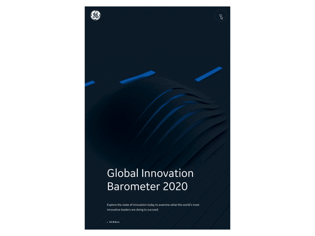
When there’s a lot to tell, throwing it all at a viewer at once could spoil the users experience. This site uses some slick moves and animation techniques more akin to a movie titles. It’s not essential, but it’s elegantly done and helps convey a lot of in-depth information. It hides information, then reveals it through animating it onto screen.
Such a simple part of the design, or at least it looks that way to the viewer. With mobiles rapidly becoming one of the primary ways you access sites, you’ve got even less space to play with than conventional web design. How items move on and off the screen is key here. Menus appearing, hiding, revealing has become its own world of design.
Like I said, we’re not web designers, we’re motion designers and animators. But there’s moving image all around us, and naturally we’re always watching what’s happening out there.