
Jonny recently wrote an article for Envato about the design of Awards graphics. Some of the key takeaways below.
Do you pay attention to the motion graphics used during awards ceremonies? While most people are paying attention to the winners and losers, the speeches, and the fashion statements, I like to see what the motion designers of the shows have been up to.
Good motion design can elevate an awards ceremony and shape the viewer’s experience, from sleek transitions to tension-building picture-in-picture sequences. As a motion designer who worked on the BAFTAs for many years, I want to highlight some key takeaways from the motion graphics used in the 2025 awards season.
Before diving into this year’s awards shows, what role do their respective motion graphics play? Primarily, they’re there to enhance the viewer experience and ensure the brand of each event is carried consistently throughout. Often, the stage designer and the graphics company will work closely together—even more so now that most stages are, in fact, giant screens.
Motion graphics are there to add drama and emphasis. They also have the more mechanical purpose of transitioning between segments. The graphics help maintain a smooth flow and keep the viewer engaged.
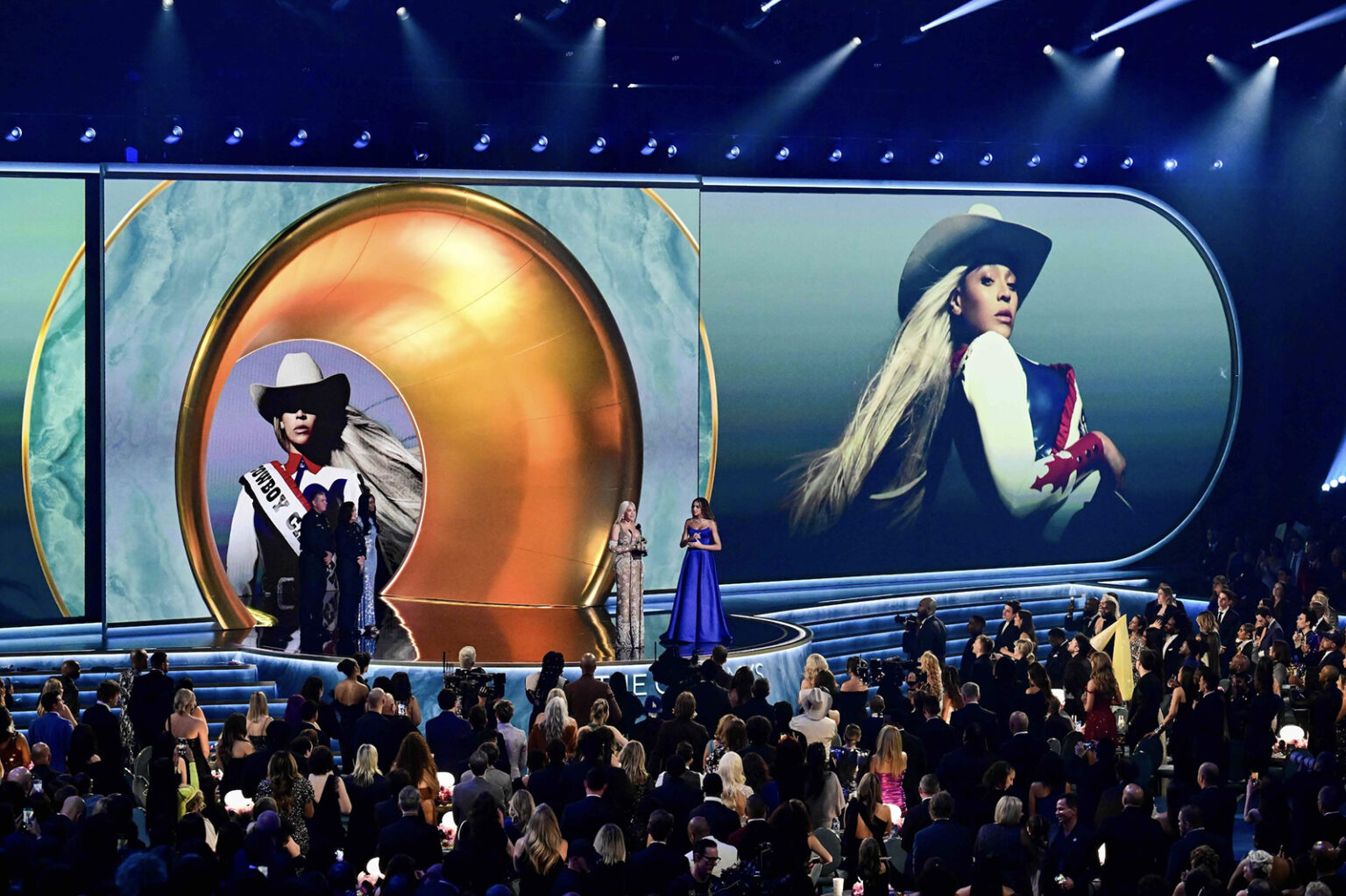
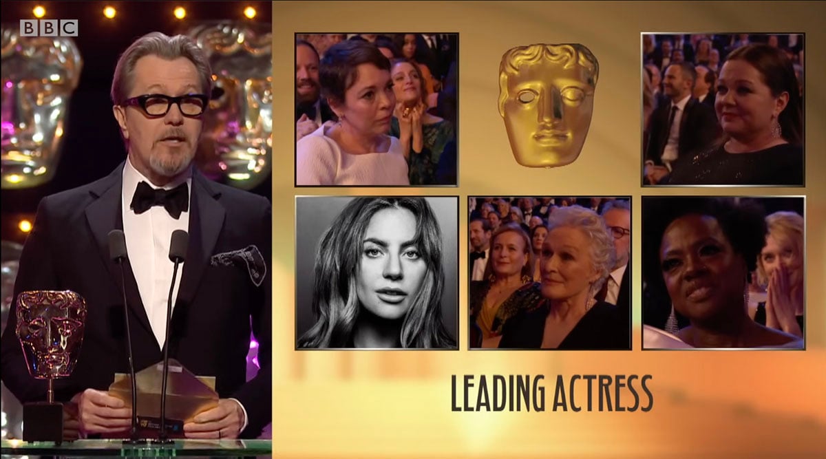
Lastly, the most essential graphic in any awards show is the framework around the legendary picture-in-picture. This is when we all watch one delighted face being embraced while several others feign their delight.
As we move out of the 2025 awards season, here’s a quick look at how events stacked up this year. Or should I say, here are this year’s nominations…
Looking back at The Oscars events through the years, you can at least say they’re consistent in their look. For a body that pioneers film, however, the Academy does seem afraid to break from the norm. Set designs are luxurious, opulence is all around, and the whole thing feels (quite rightly) huge and expensive. Motion graphics are perhaps not very high in the order of priorities.
This hasn’t always been the case, though. The direction will come from the production and stage design. Back in 2015, The Oscars went all in, bringing in some of the industry’s best with designer Henry Hobson and Elastic TV. Each nomination montage felt like its own TV titles, which is unsurprising considering that Elastic is a leader in this field.
Quoting a great interview with Motionographer, Henry explains how the designs in 2015 were pushed as much by their growing presence on social media and not just by the physical need at the awards.
“Now the most important spaces are all on social media. People sharing the work and searching out what they like in online communities is equally as exciting.” — Henry Hobson
Sadly, for a titles fan like me, I haven’t seen anything approaching this caliber of artistry since, and I hope we see a return to this level of craft in future awards seasons.
Aaah, the BAFTAs are the UK’s warm-up to the Oscars, and an awards ceremony that has rarely managed to push the boundaries. Maybe this is a similar case to the Oscars? Aesthetics always center around the famous BAFTA mask, a hugely recognizable asset, but like the Academy Awards, the BAFTAs feel a little hamstrung by it.
The latest refresh was in 2023. Having worked on the BBC awards for over 10 years, I get a sense that a couple of years ago, there was either more creative freedom given or more budget—or both! Creative Nuts gave the awards a well-needed polish and a touch of neon. With Strictly Come Dancing in its portfolio, the agency introduced some nice sparkle to the look. The sparkly particles and depth of field really do give it a premium vibe.
To read the rest of the article, head over to Envato.